FINORA - Brand Identity
Finora is a strategic energy transition brand that supports companies in redesigning their energy systems for a more sustainable future.
It is not an energy producer.
It is not an emotional “green” brand.
It is a technological enabler.
Finora helps organizations:
- Optimize energy consumption
- Integrate sustainable solutions
- Reduce environmental impact
- Plan future-ready infrastructures
Its positioning is built on three pillars: Technology. Responsibility. Long-term vision.


Naming
“Finora” means “until now” in Italian.
It represents both the current state of energy systems and a strategic shift:
Until now we did it this way.
From now on, we do it better.
Simple. Memorable.
Open to evolution.
Visual Identity
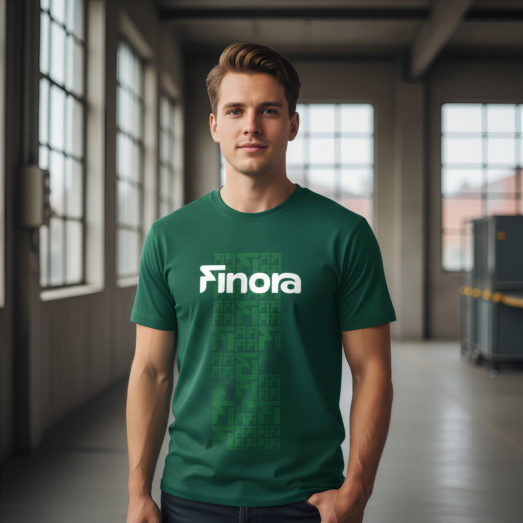
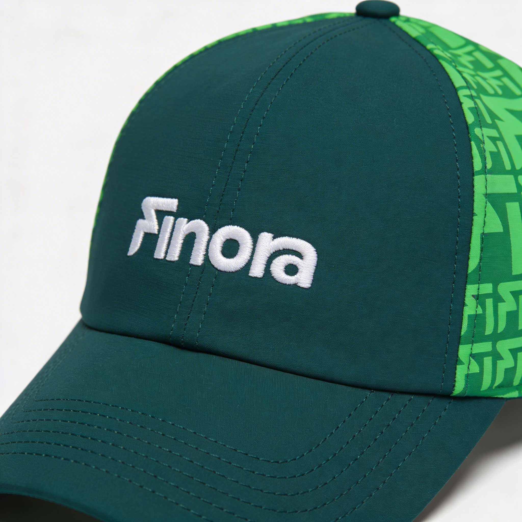
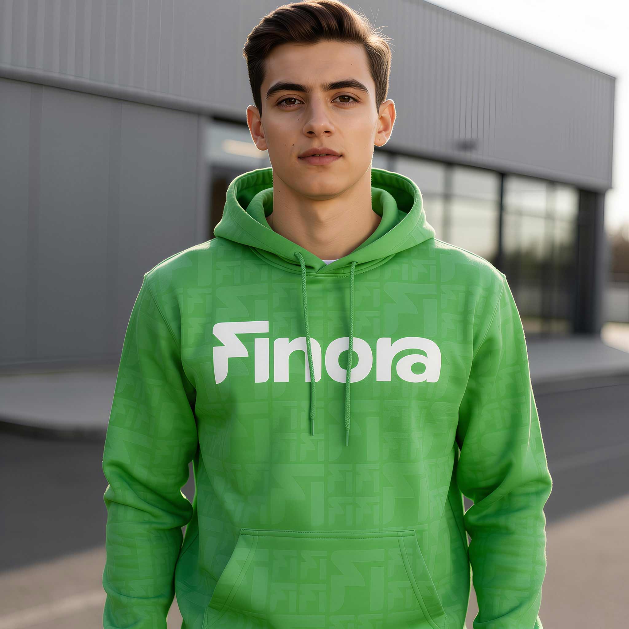
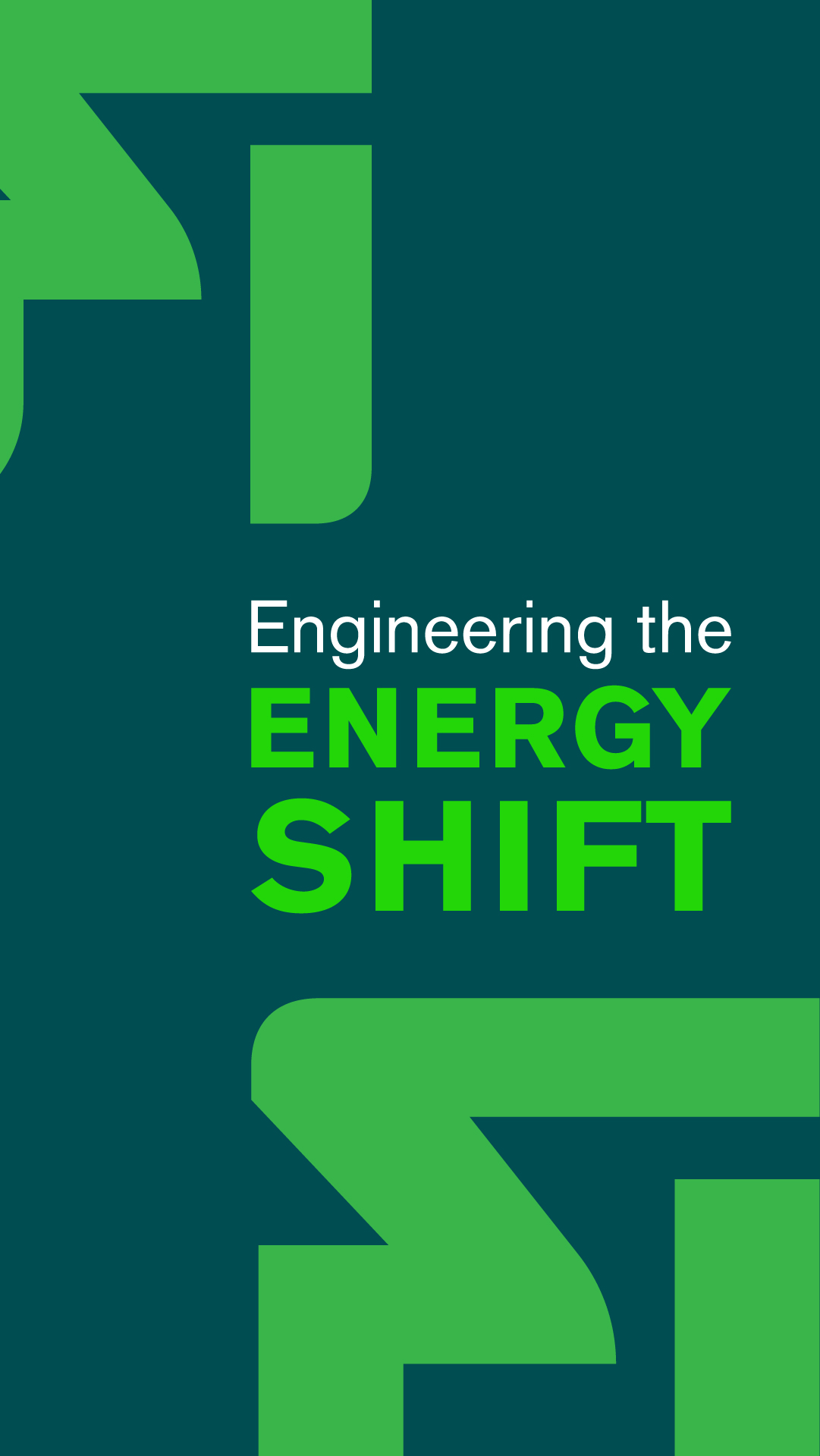
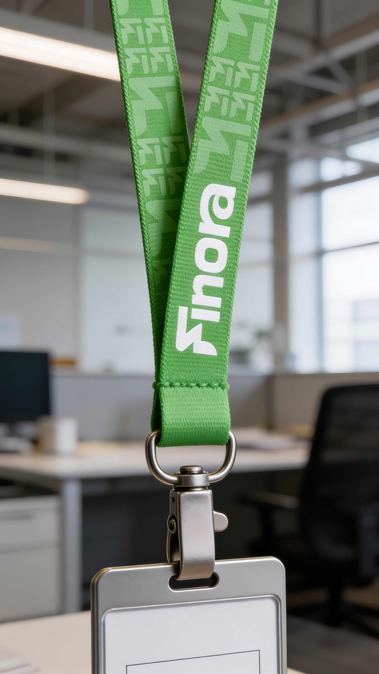
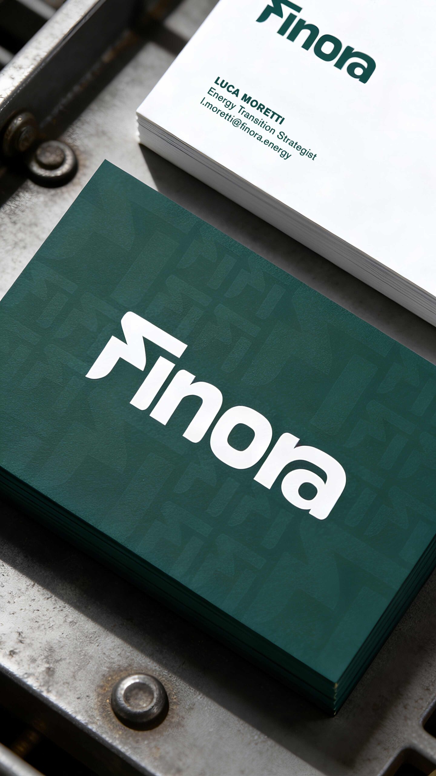
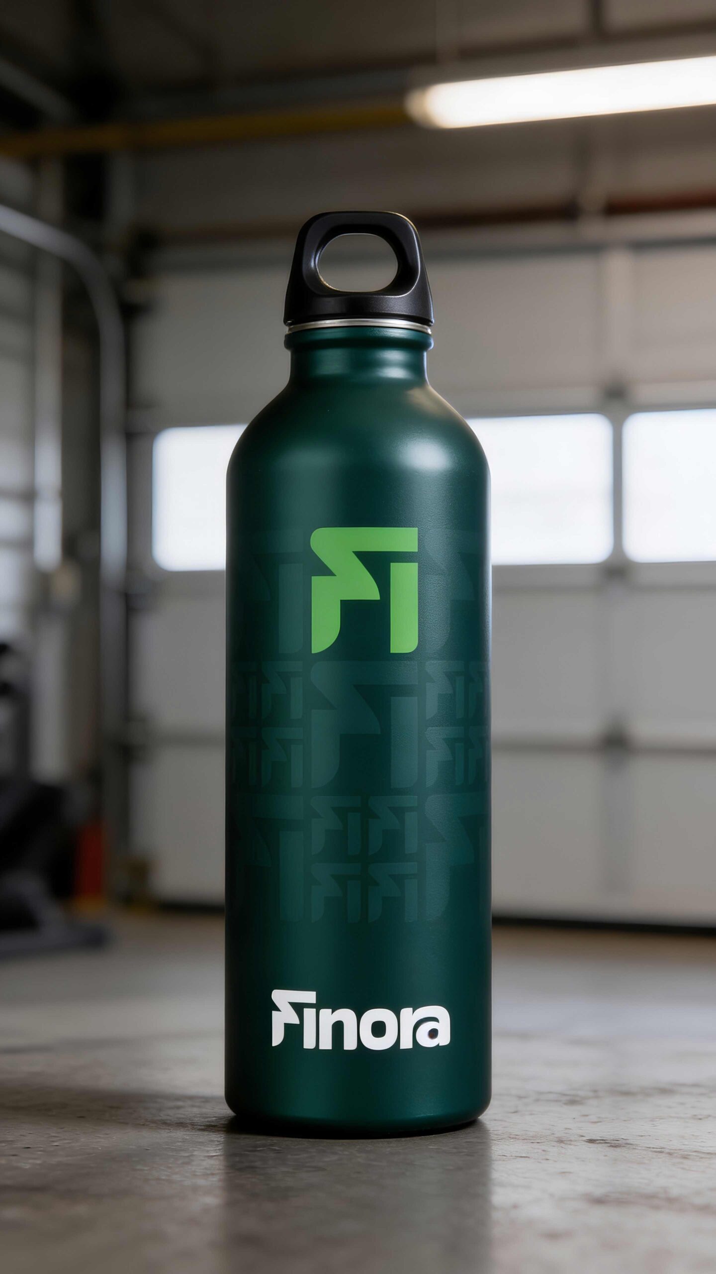
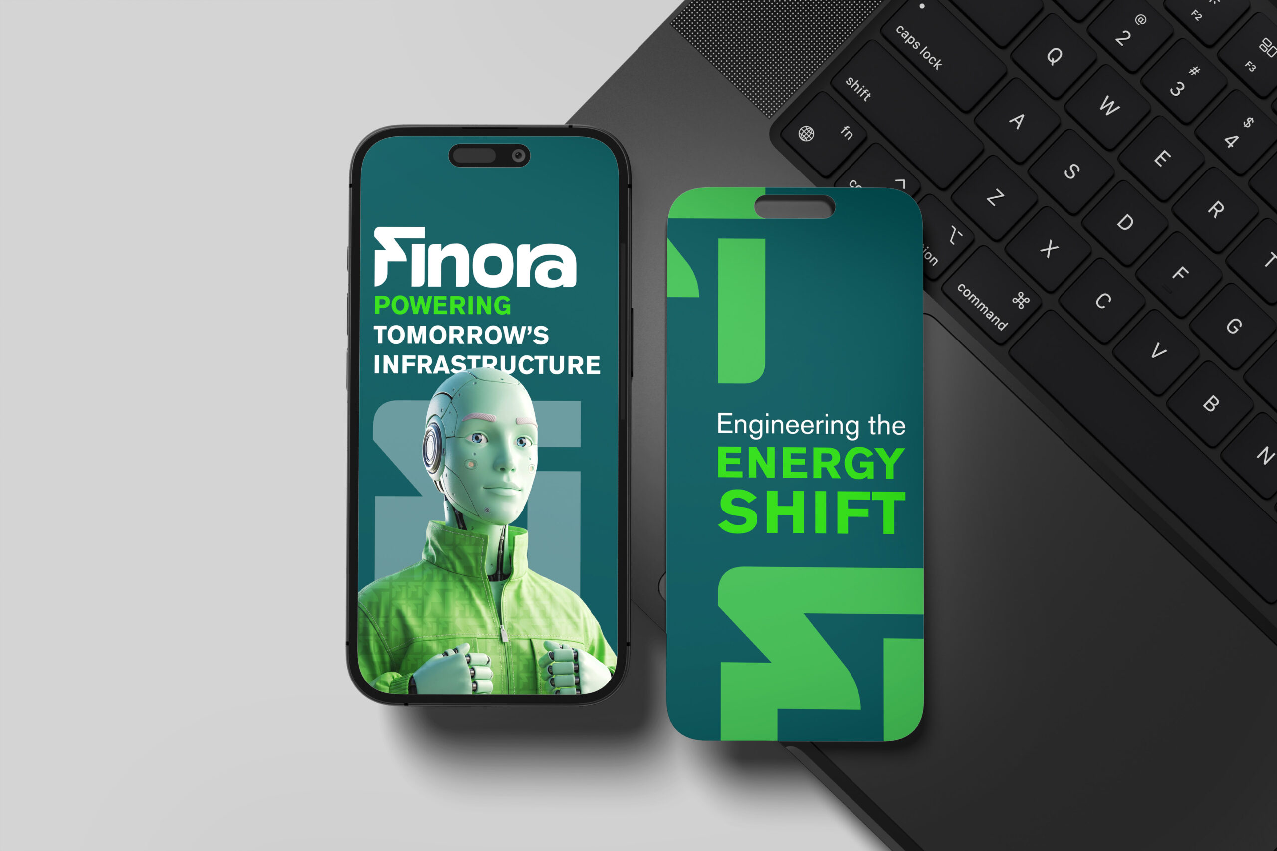
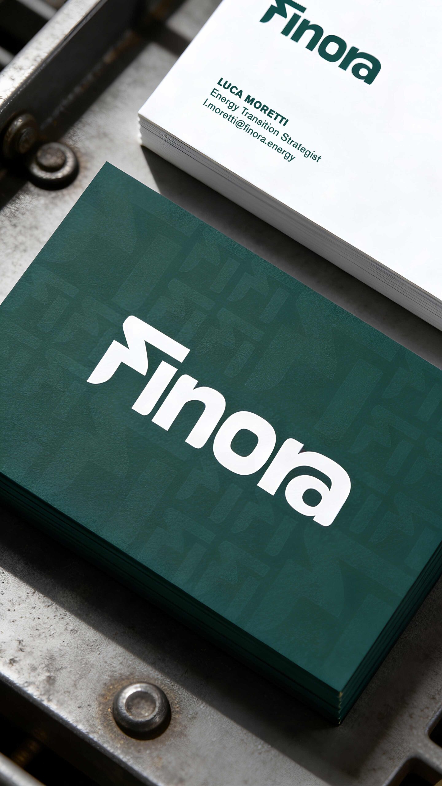
The FI symbol is structural, not decorative.
A compact synthesis of F + I
A modular, infrastructural form
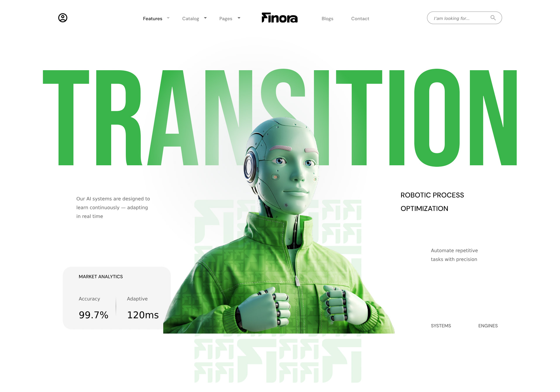
A visual element designed to become pattern and system
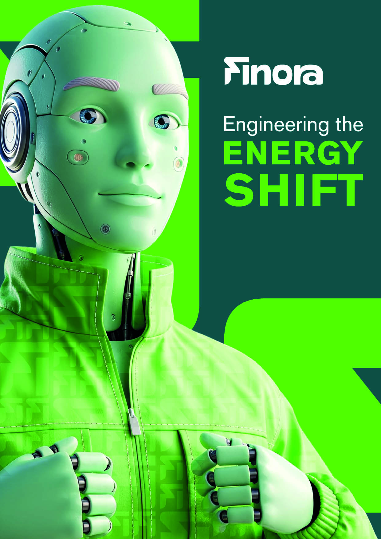
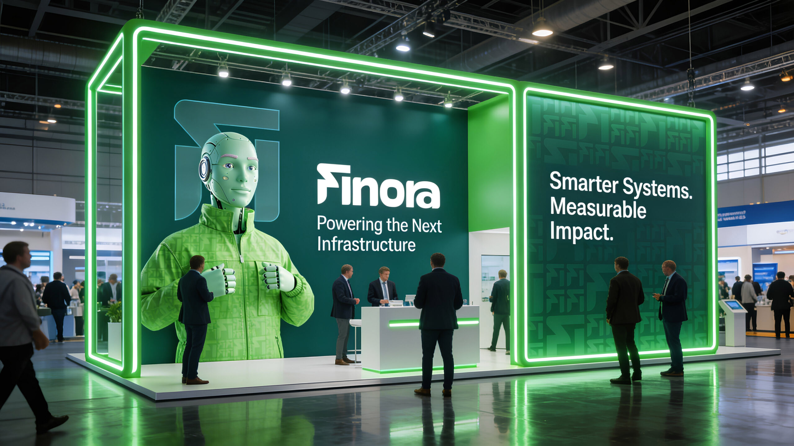
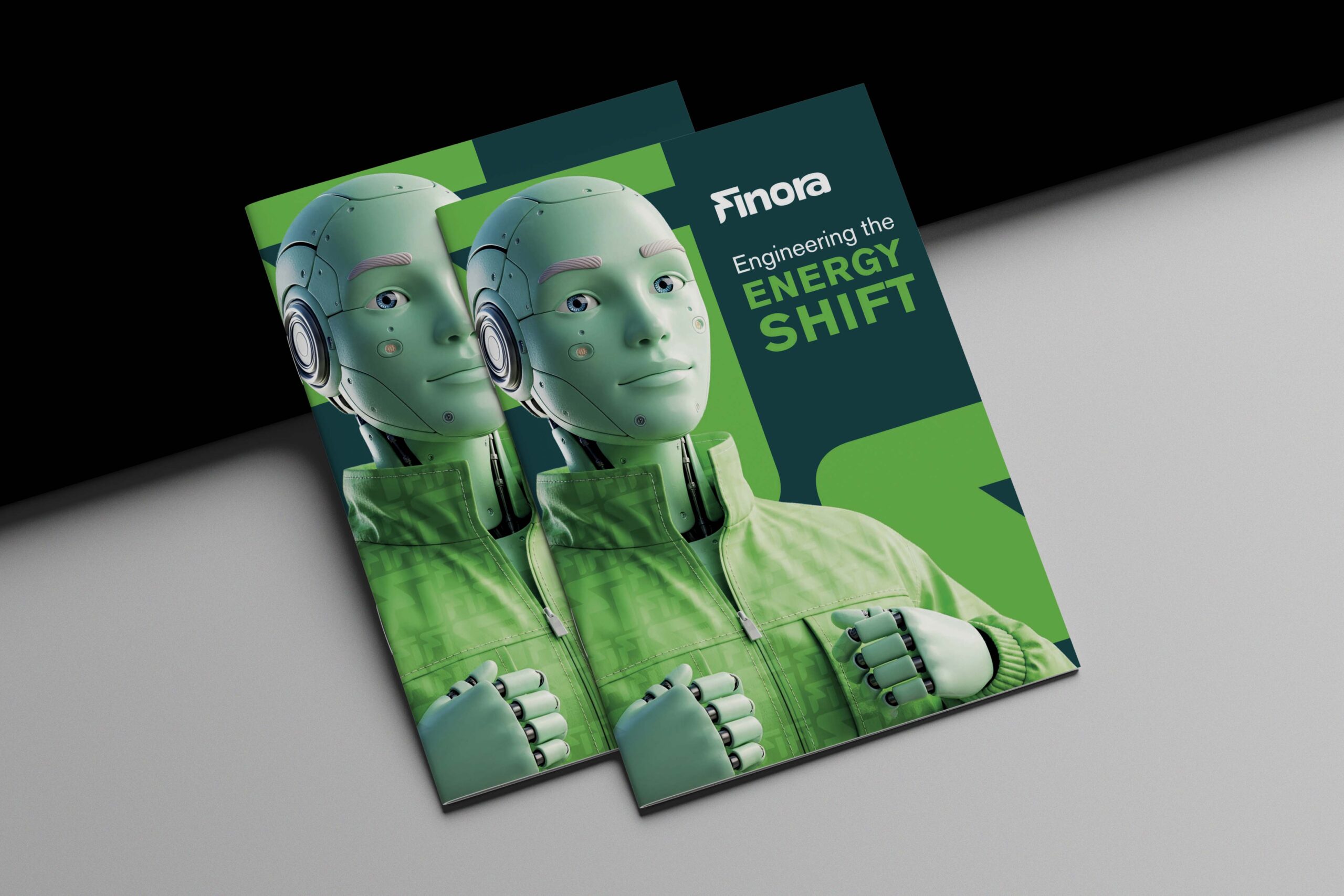
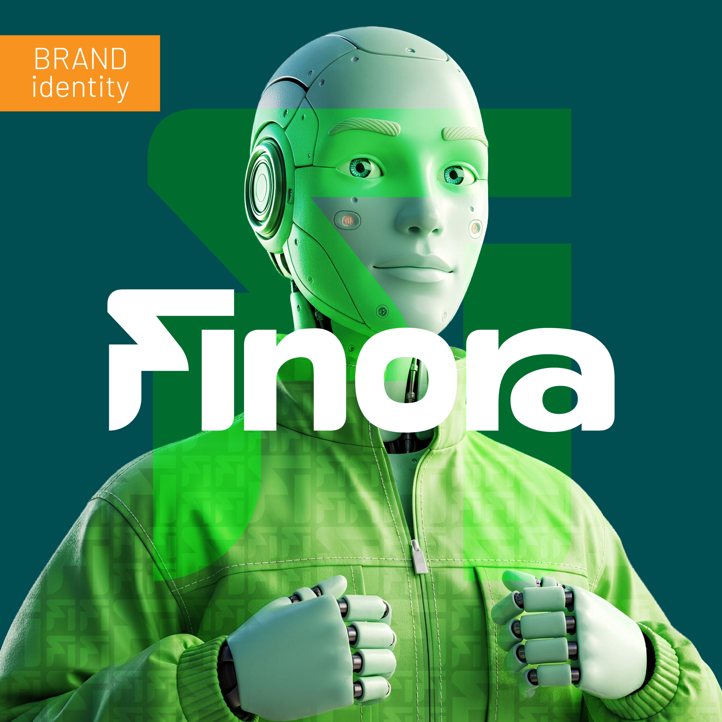
The vibrant green represents energy as an active force.
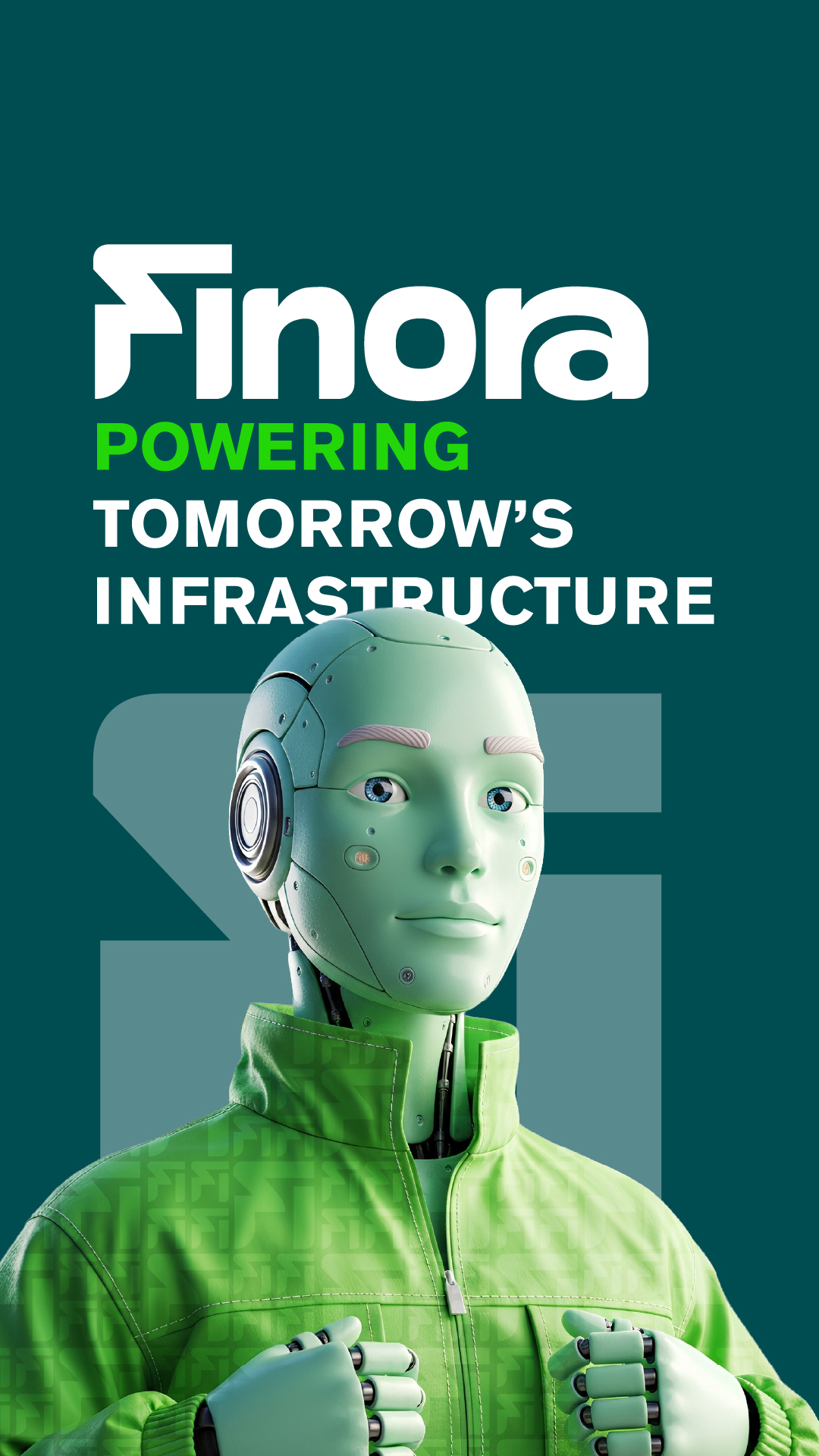
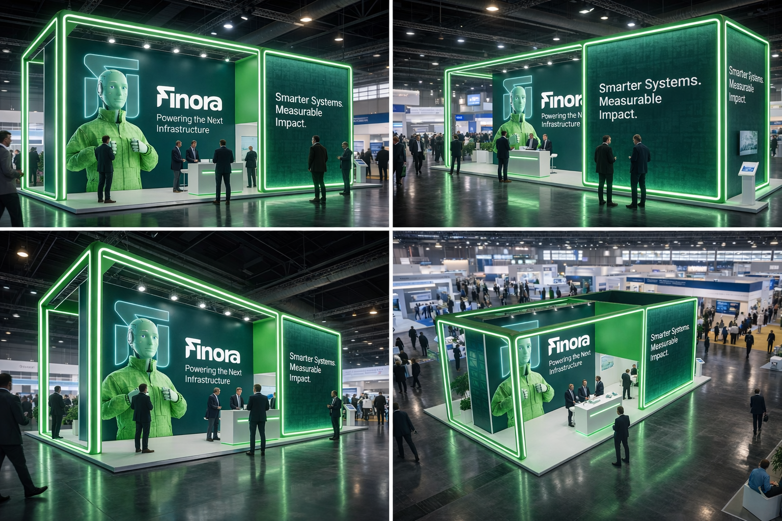
The robotic figure symbolizes humanized technology.
The identity expresses transition, control, and forward movement.