ULICA - Brand Identity

ULICA is the brand identity of an urban e-bike sharing service:
electric bikes you unlock, ride and drop anywhere in the city.
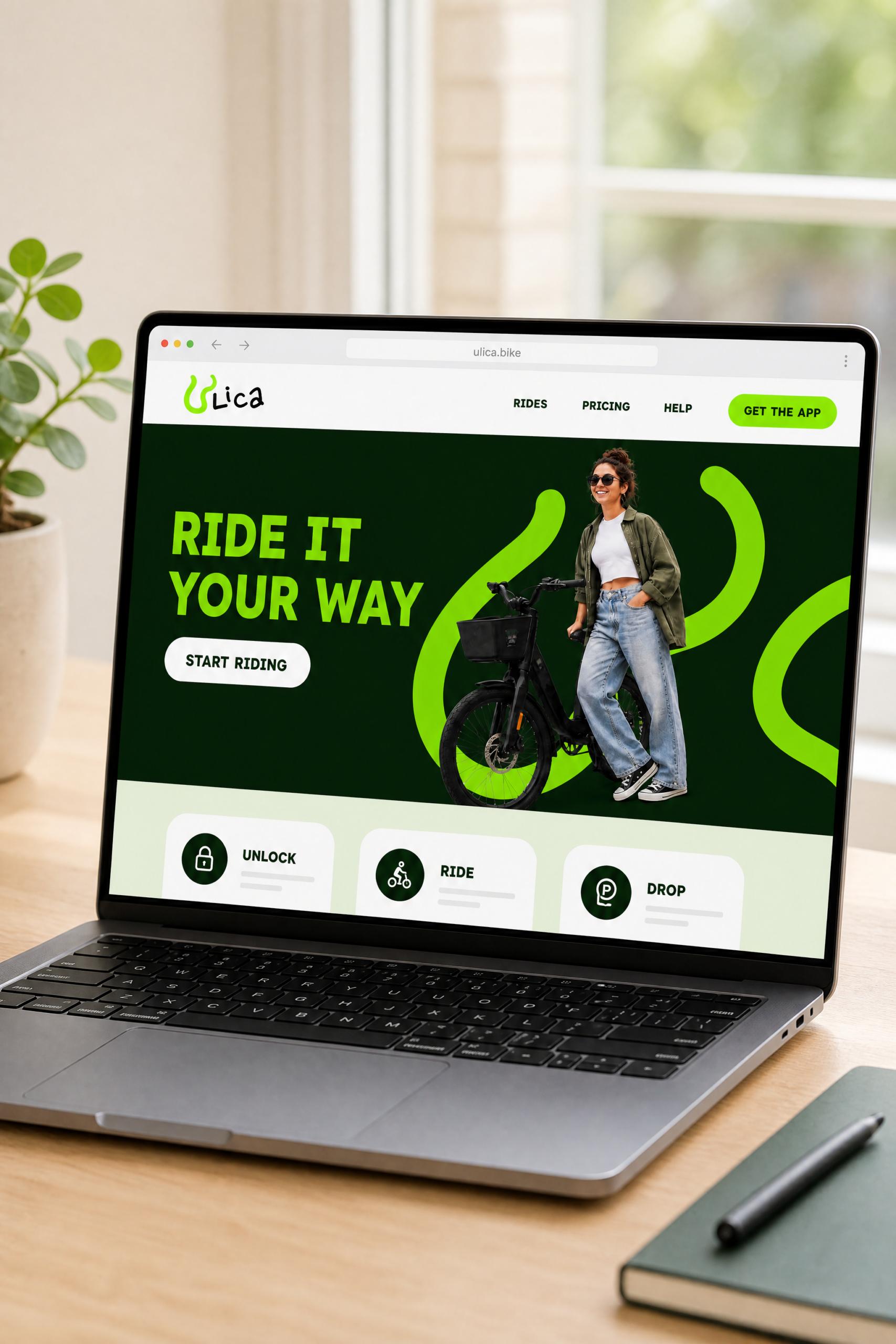
The street is the product, the playground and the promise, condensed in the payoff: Ride it your way.
The identity is built for a young audience of students, commuters and city riders: a handwritten logotype, a sign system made of winding roads, and a palette of natural greens, from deep forest to acid green, standing for electric energy and sustainability.
The tone is direct, young, a little irreverent.
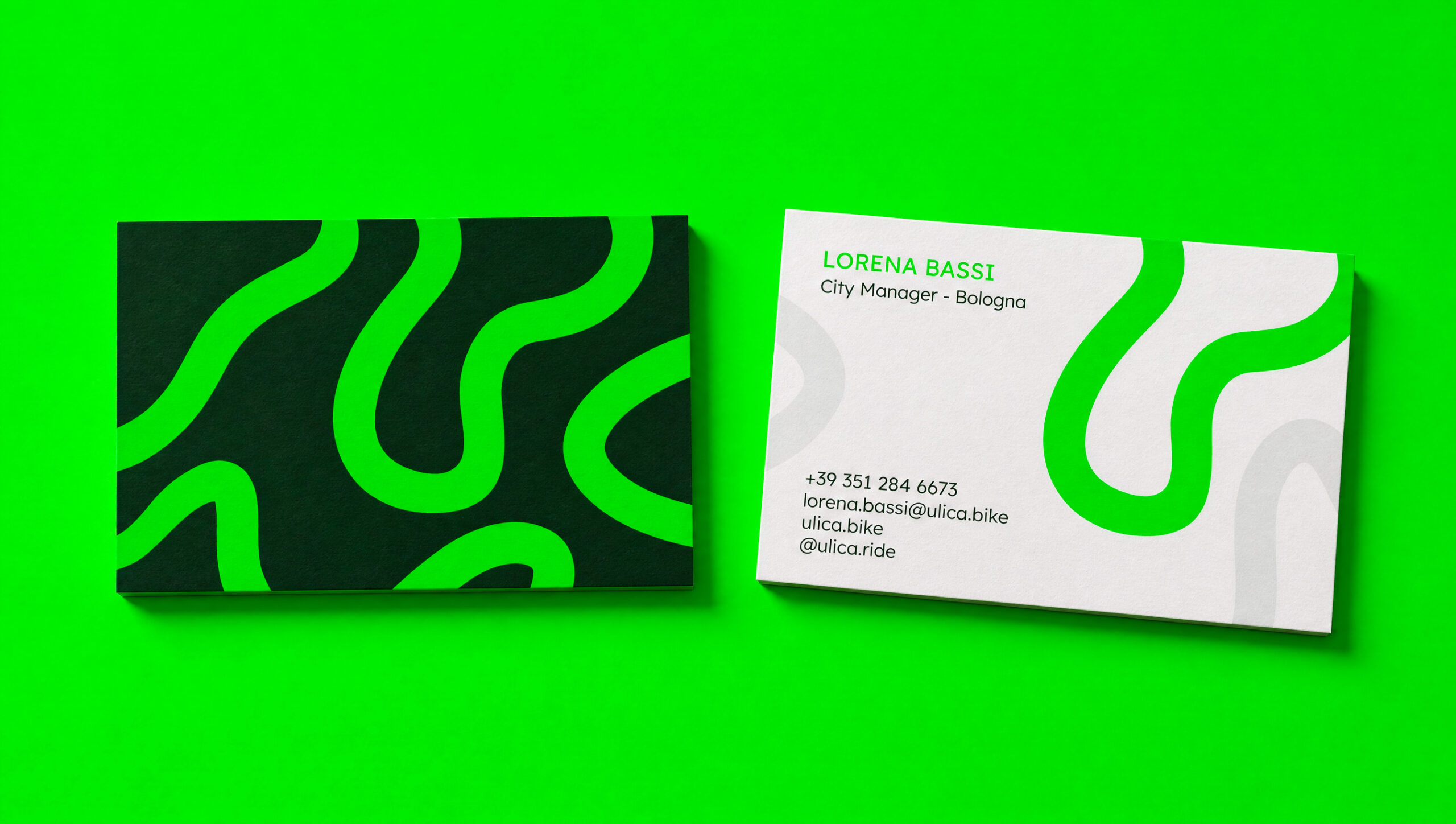
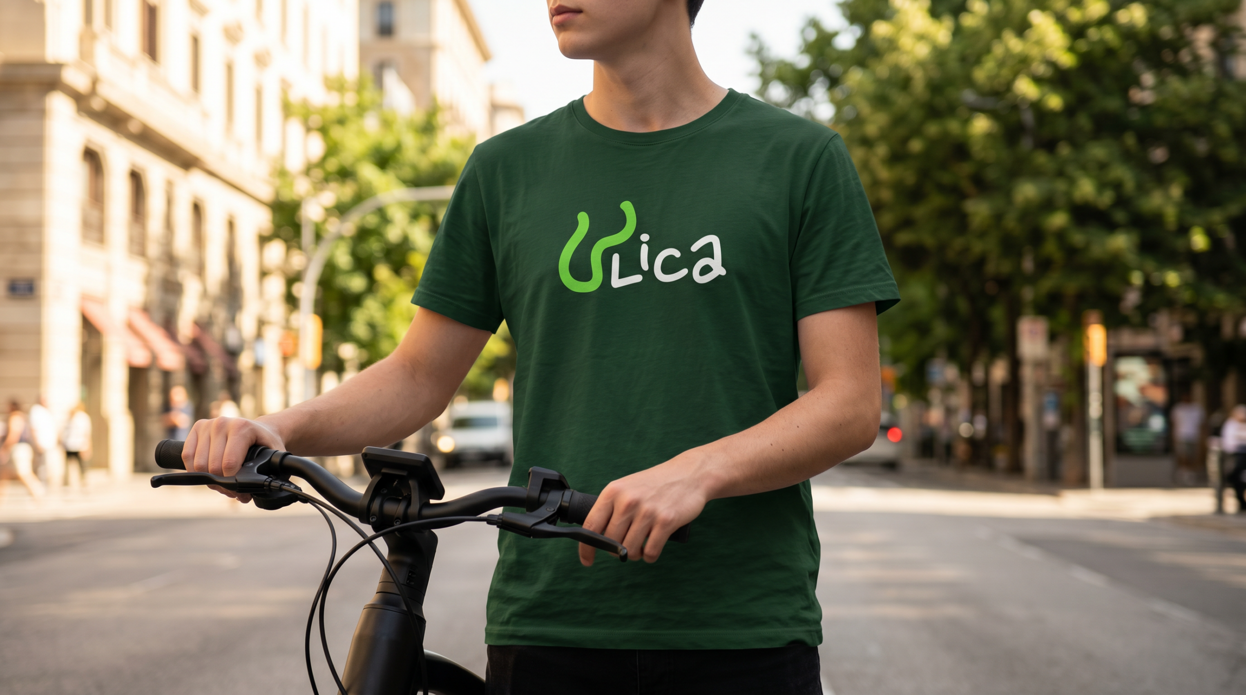
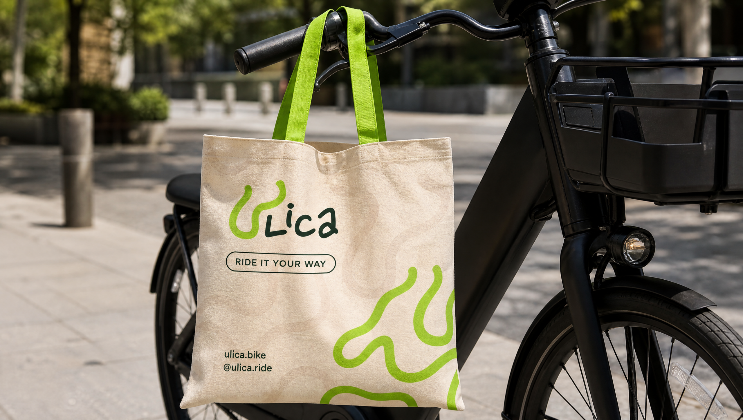
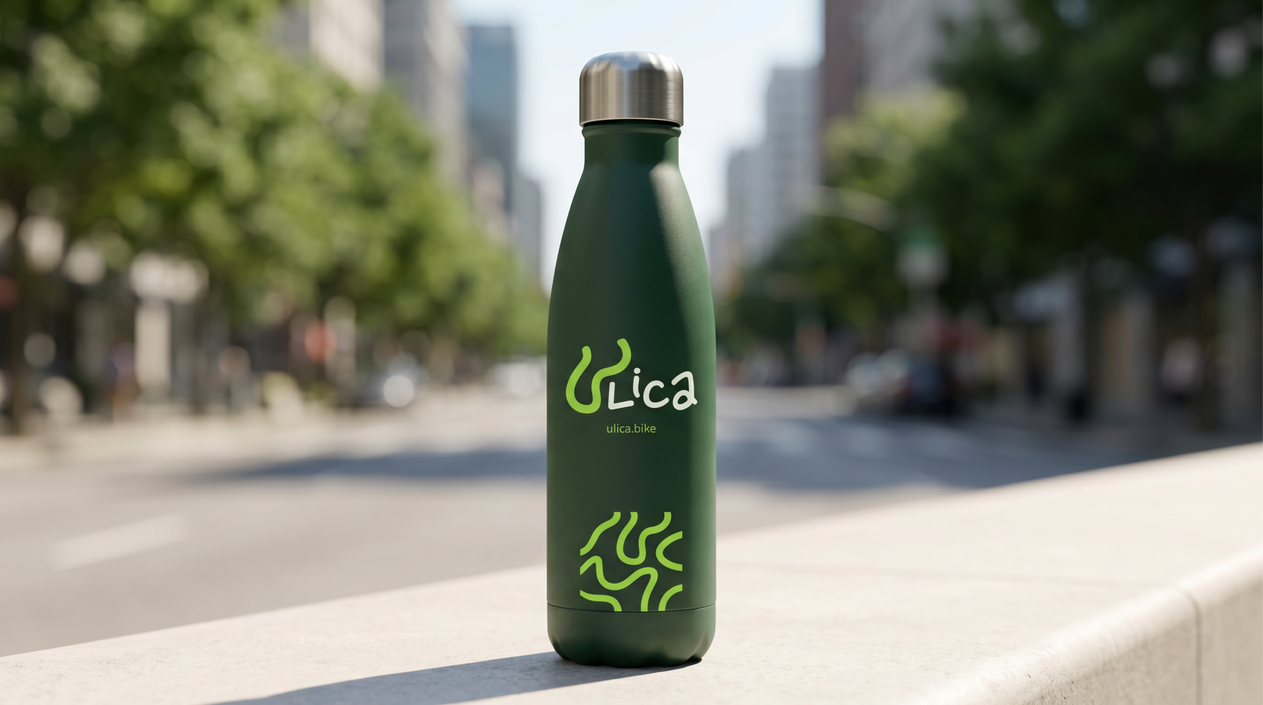
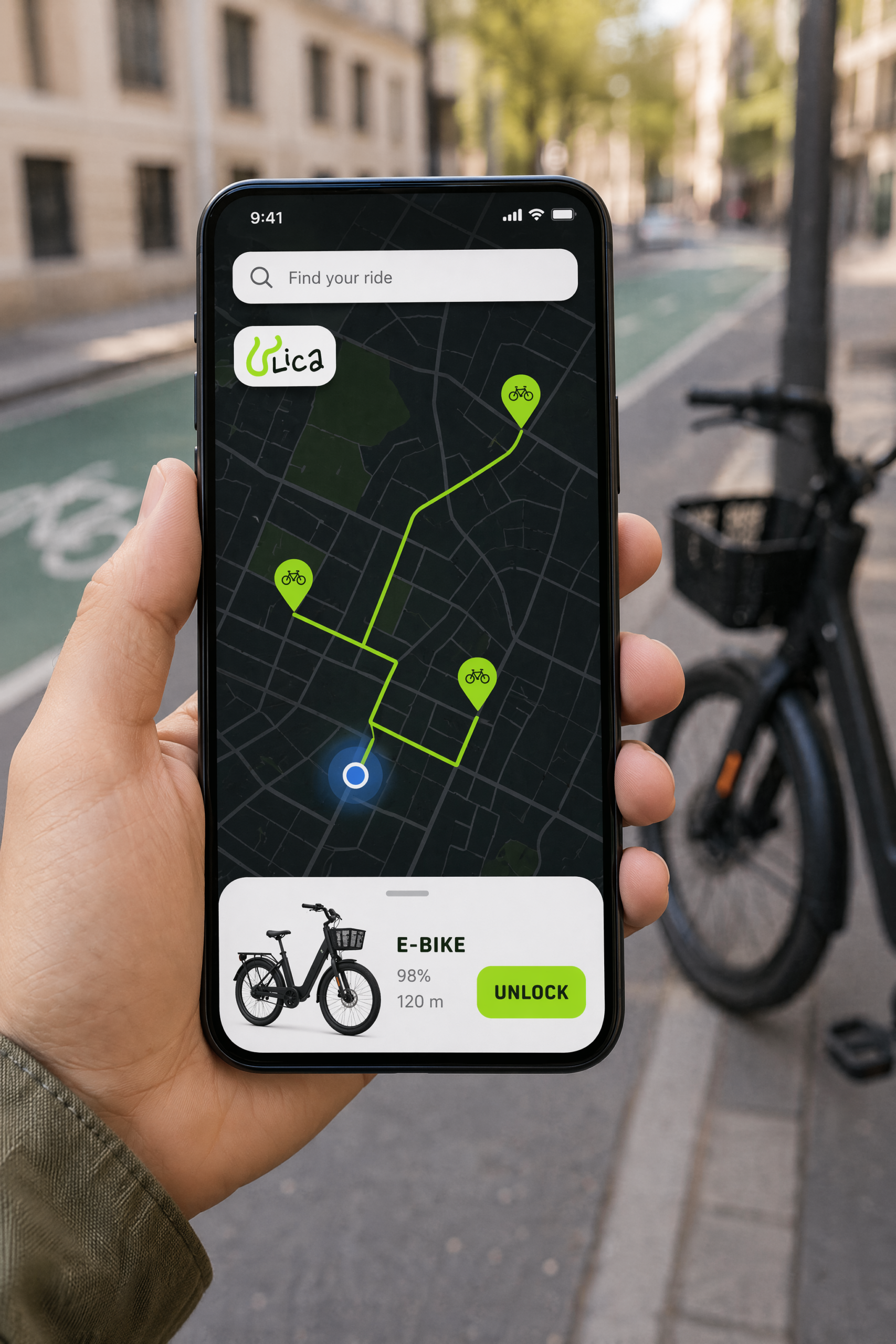
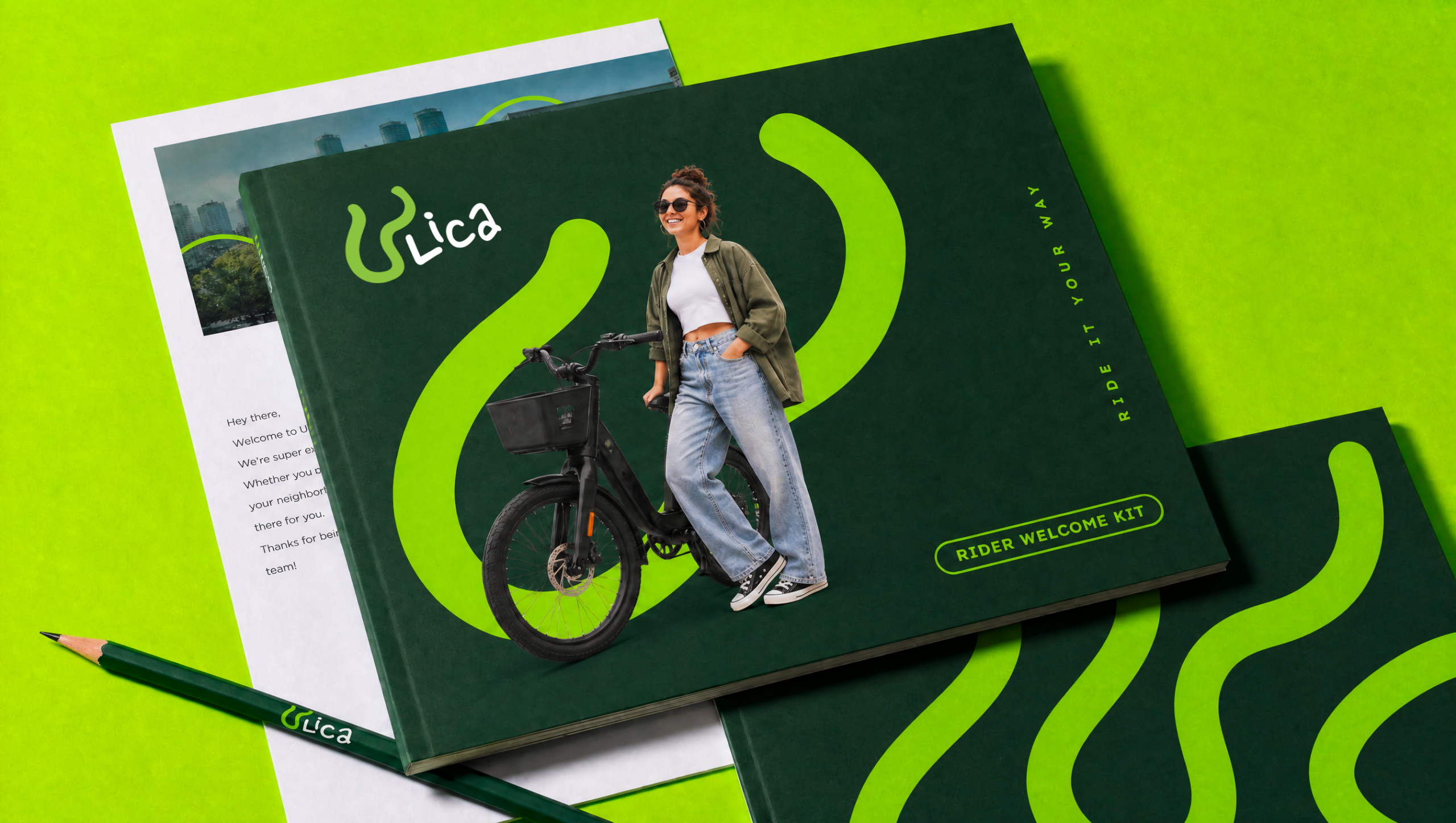
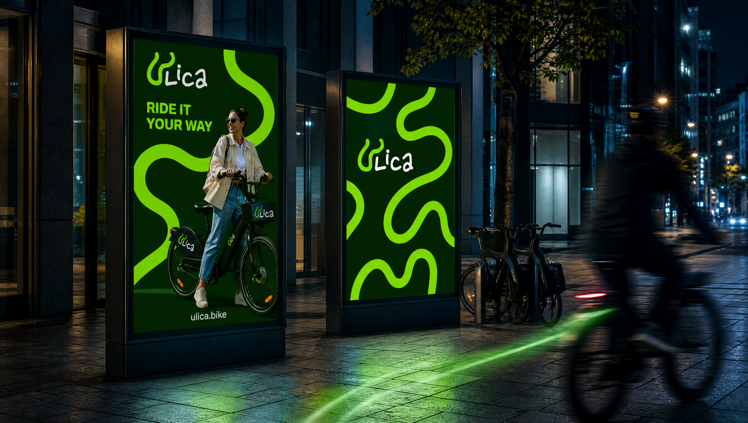
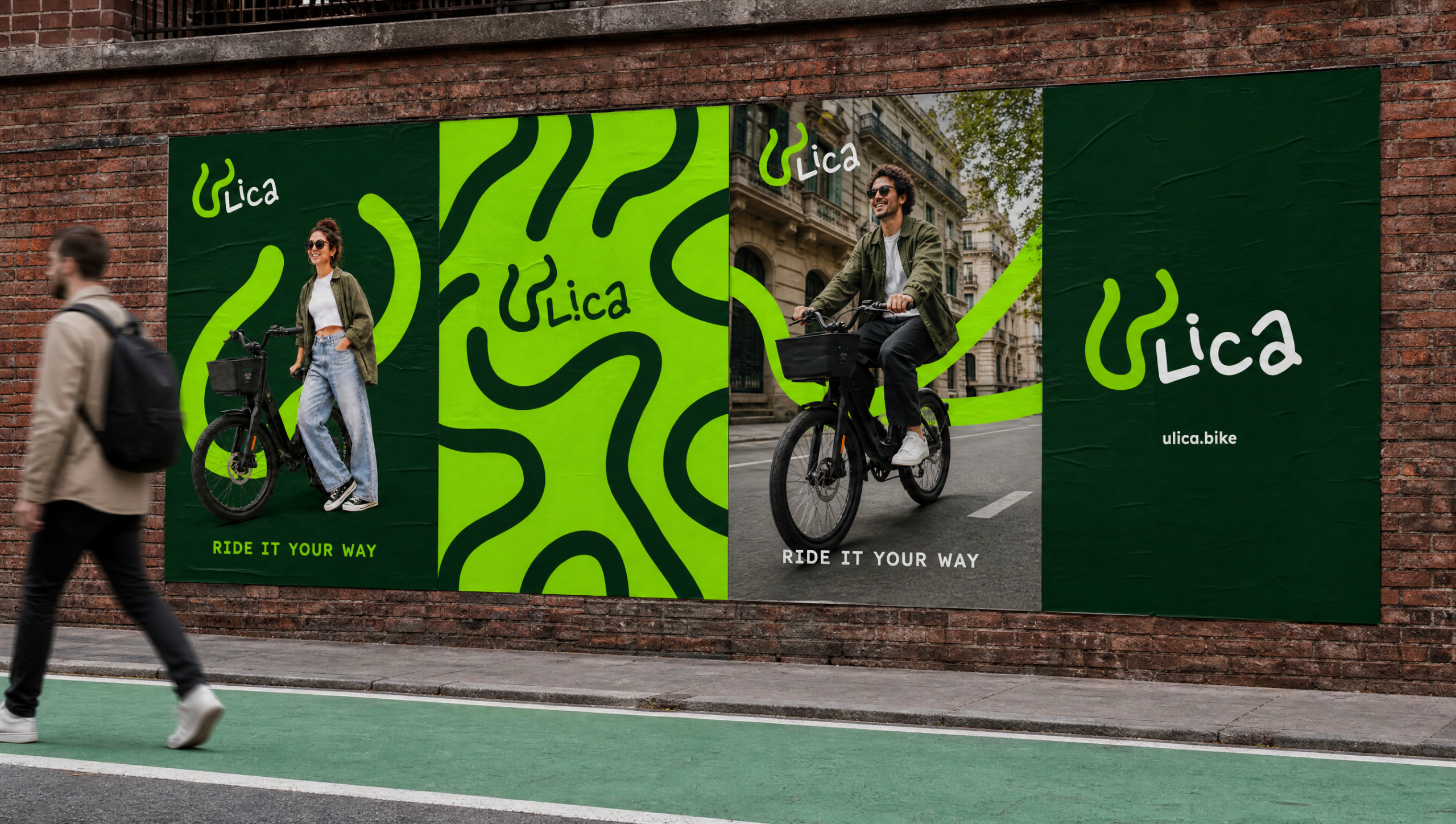
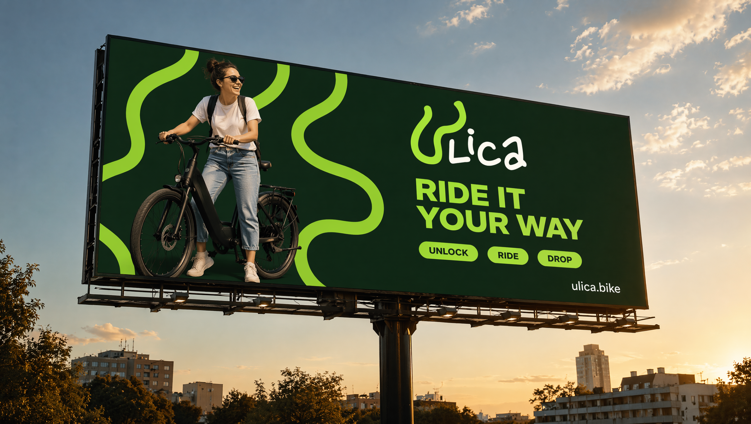
Scope: logo, sign and pattern system, business card, welcome kit, out-of-home campaign, app and website, merchandising. Self-initiated concept project.
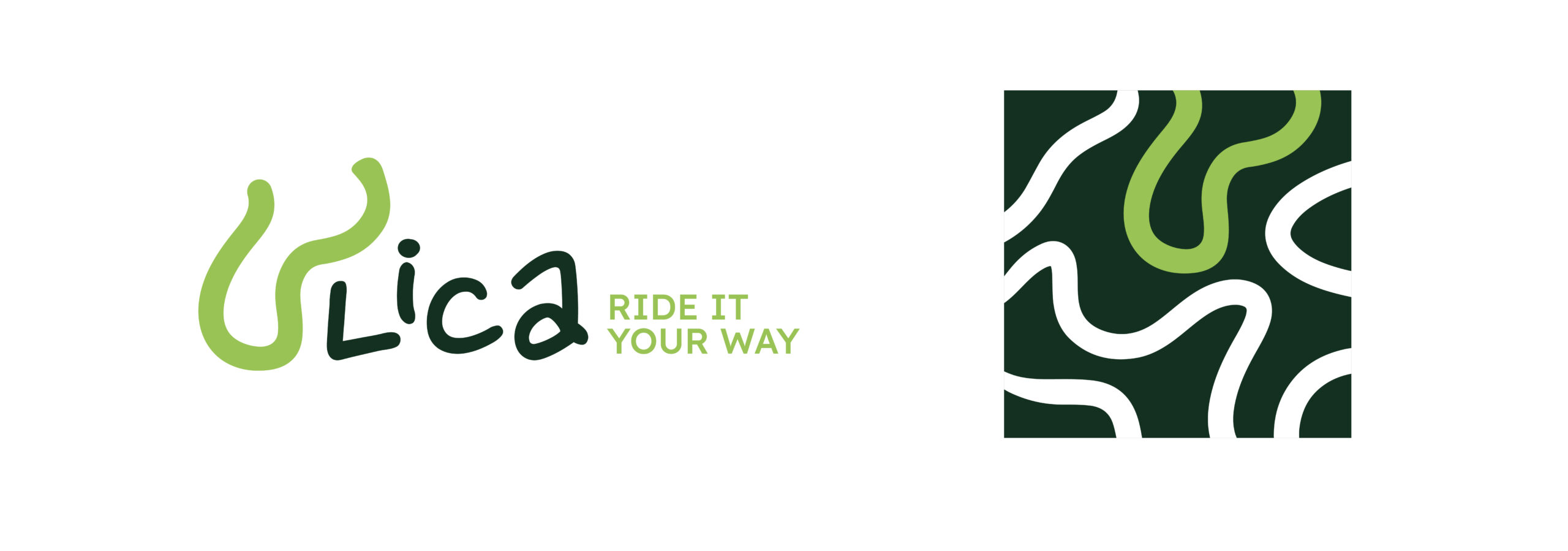
The logotype is handwritten, and the U is not a letter: it is a road. A single green stroke, with the same constant thickness as the sign system, winds down and back up like a street changing direction, and draws the U on its way.
Next to it, “Lica” is written with the imperfect rhythm of a rider’s signature, white on the dark green surfaces of the brand, deep green on light backgrounds. 
Since the U is literally a piece of the ULICA road system, it carries the identity alone when space gets small, from the app icon to the map pins.
In the full lockup the payoff Ride it your way sits to the right of the wordmark, on two lines.
The brand sign is a road. Winding organic lines with constant thickness and soft curves cross every surface like streets crossing a city, with no letters and no monogram: pure movement. 
The sign scales from a single giant road wrapping a key visual to a full pattern in multiple colorways, white on deep green, white on bright green, dark on acid green.
A square version, where one green road hints at the U, works as avatar and app icon.
Every application draws its own route, because no ride is the same.

Privacy Preference Center