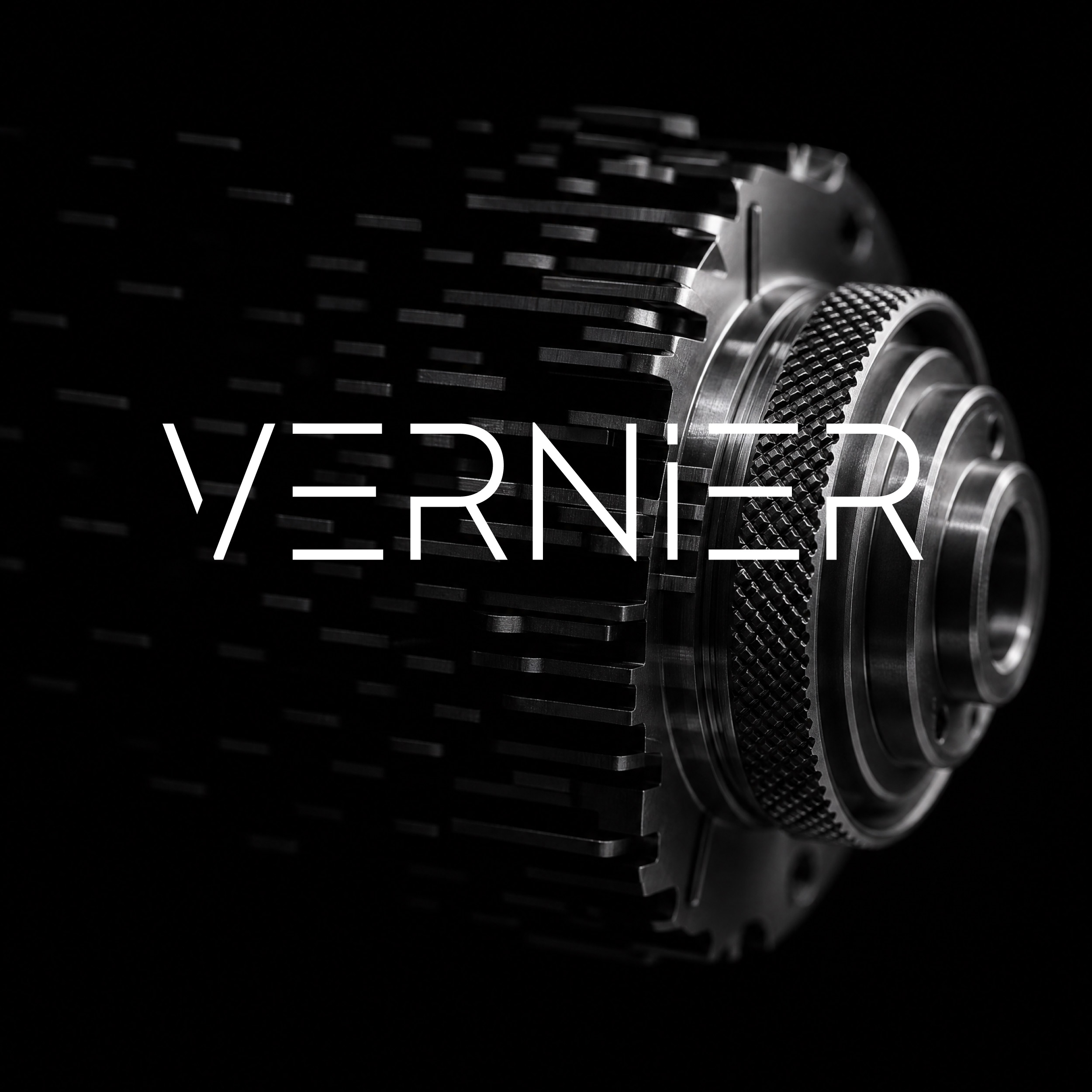
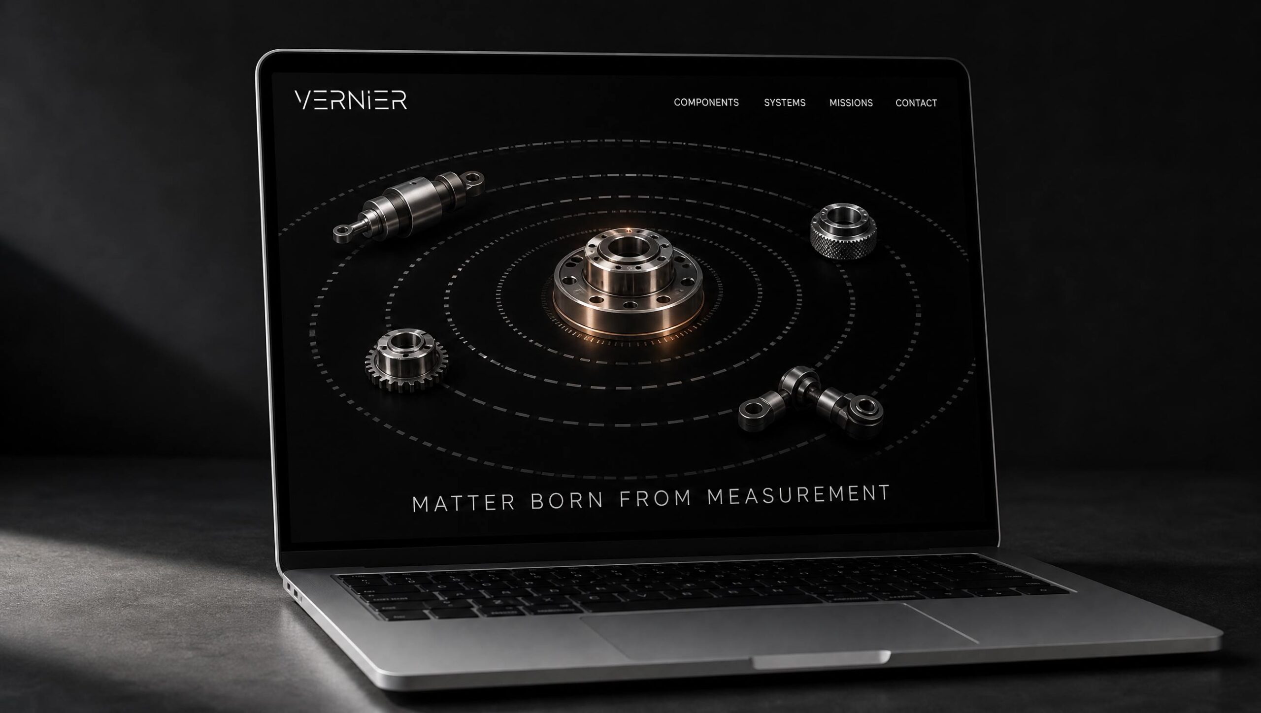
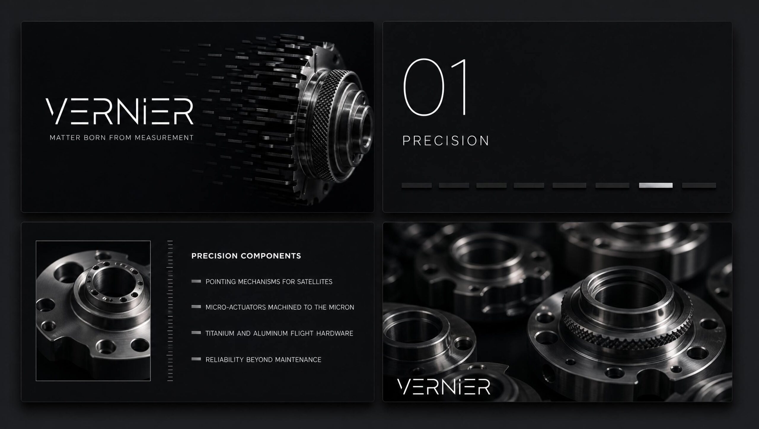
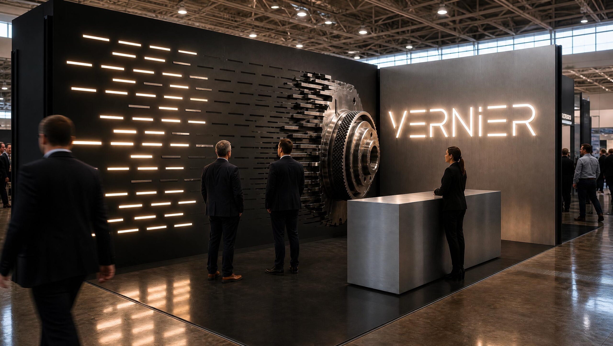
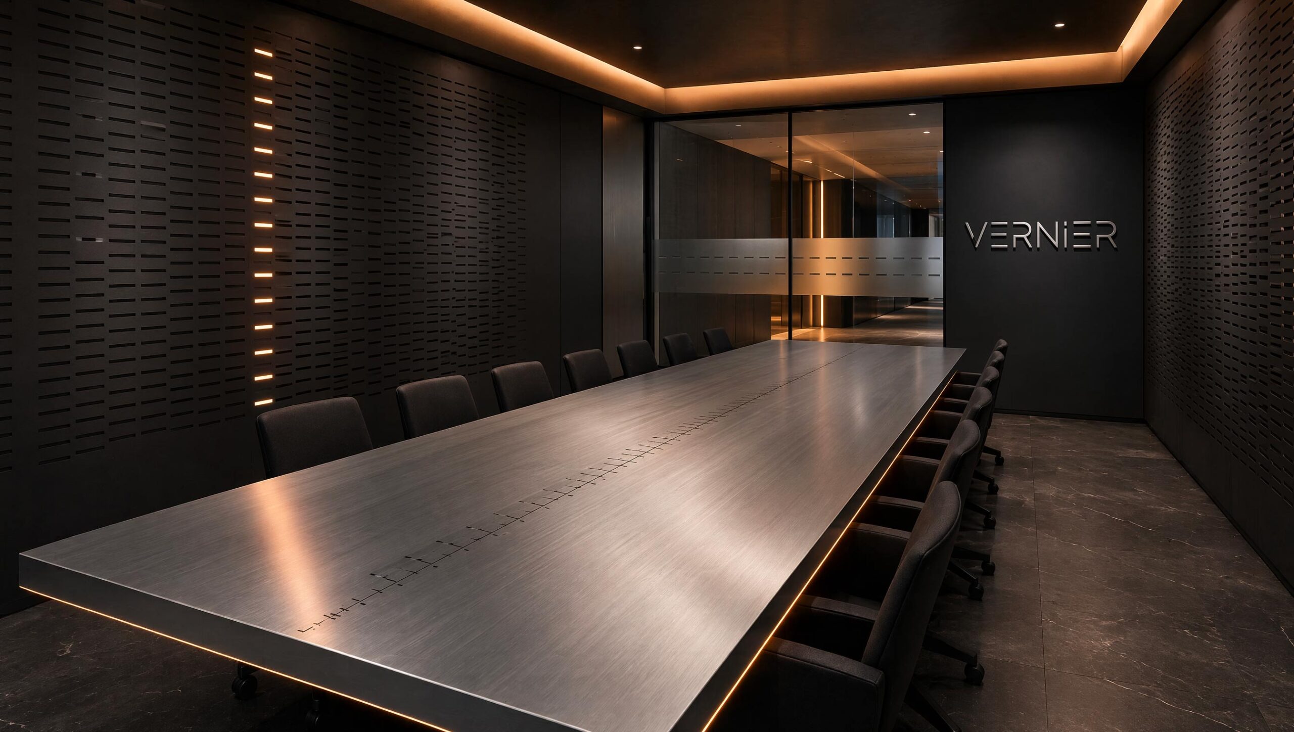
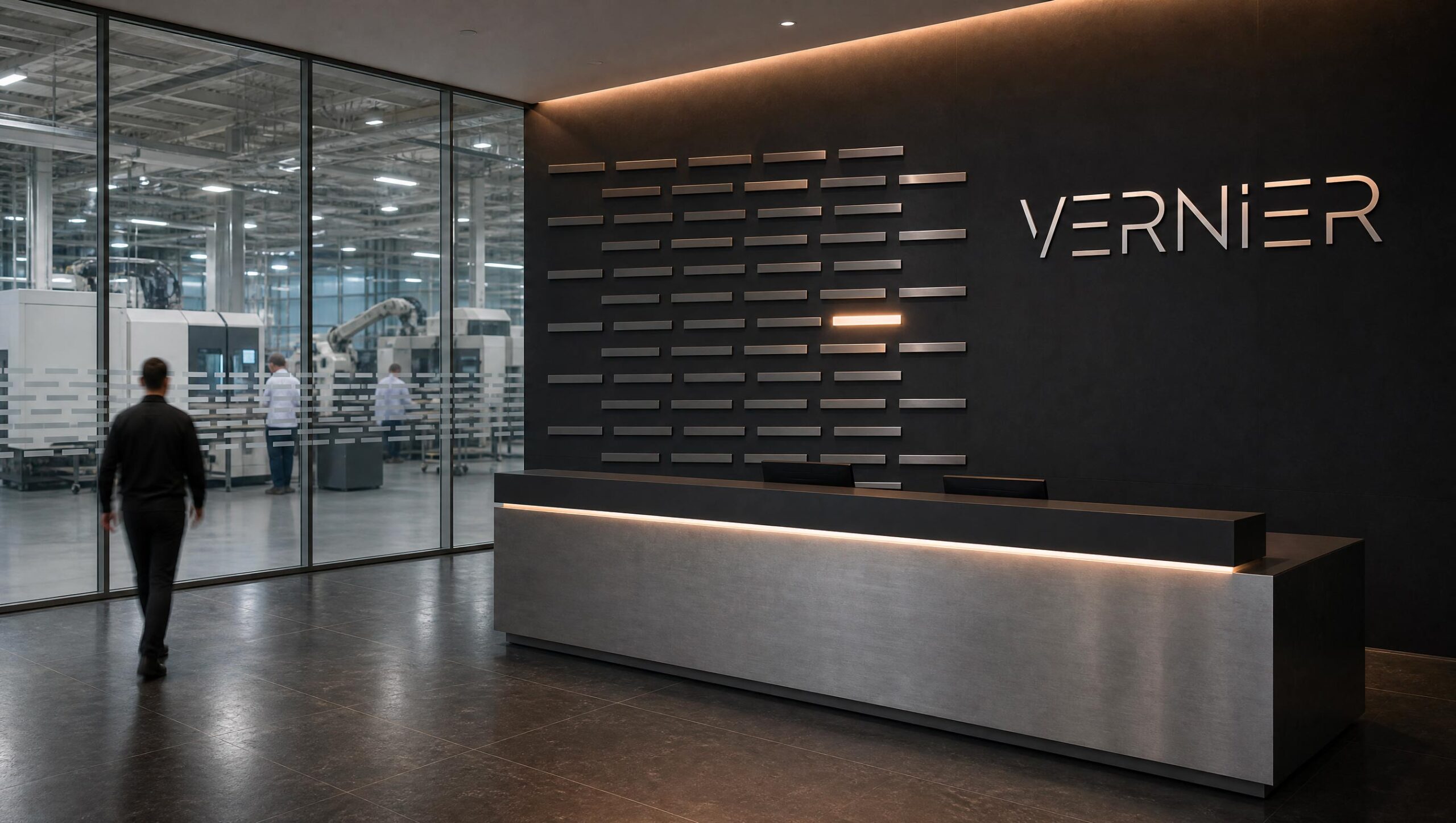
VERNIER is the brand identity of an aerospace company that builds precision components and subsystems for satellites and launch vehicles:
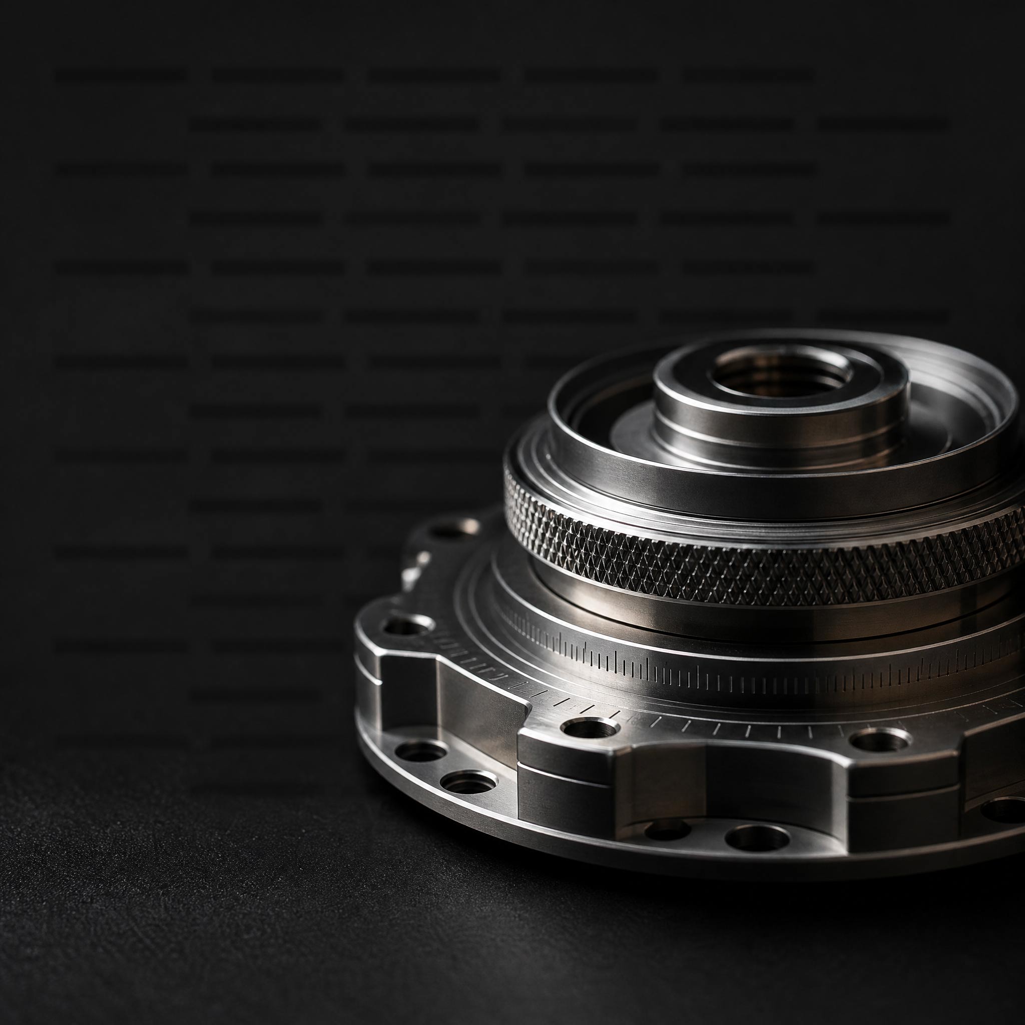
pointing and release mechanisms, actuators, structures machined to the micron.
Small parts, immense distances.
The name comes from the vernier scale, the scale that turns a caliper into a precision instrument.
In aerospace, vernier thrusters handle the fine adjustments of spacecraft.
Precision and space in a single word, already native to the industry.
The identity stays away from space rhetoric: no rockets, no flames. The visual language is closer to fine watchmaking than to sci-fi.
CNC aluminum, titanium, matte instrument black, generous white space, measurements and figures used as graphics.
The logotype is a light geometric uppercase with strokes broken like the marks of a graduated scale, and a lowercase i dotted as a reading index.
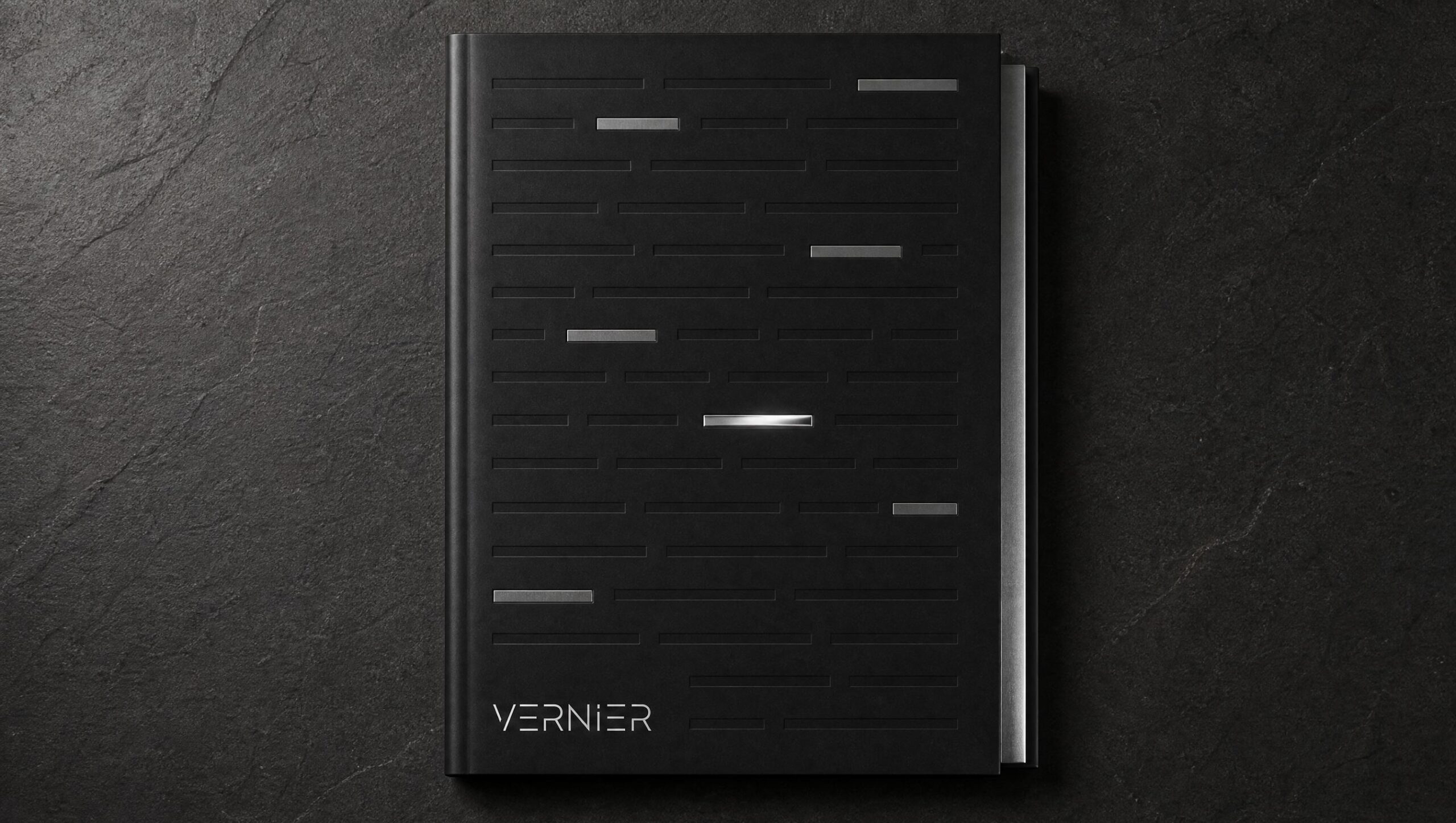
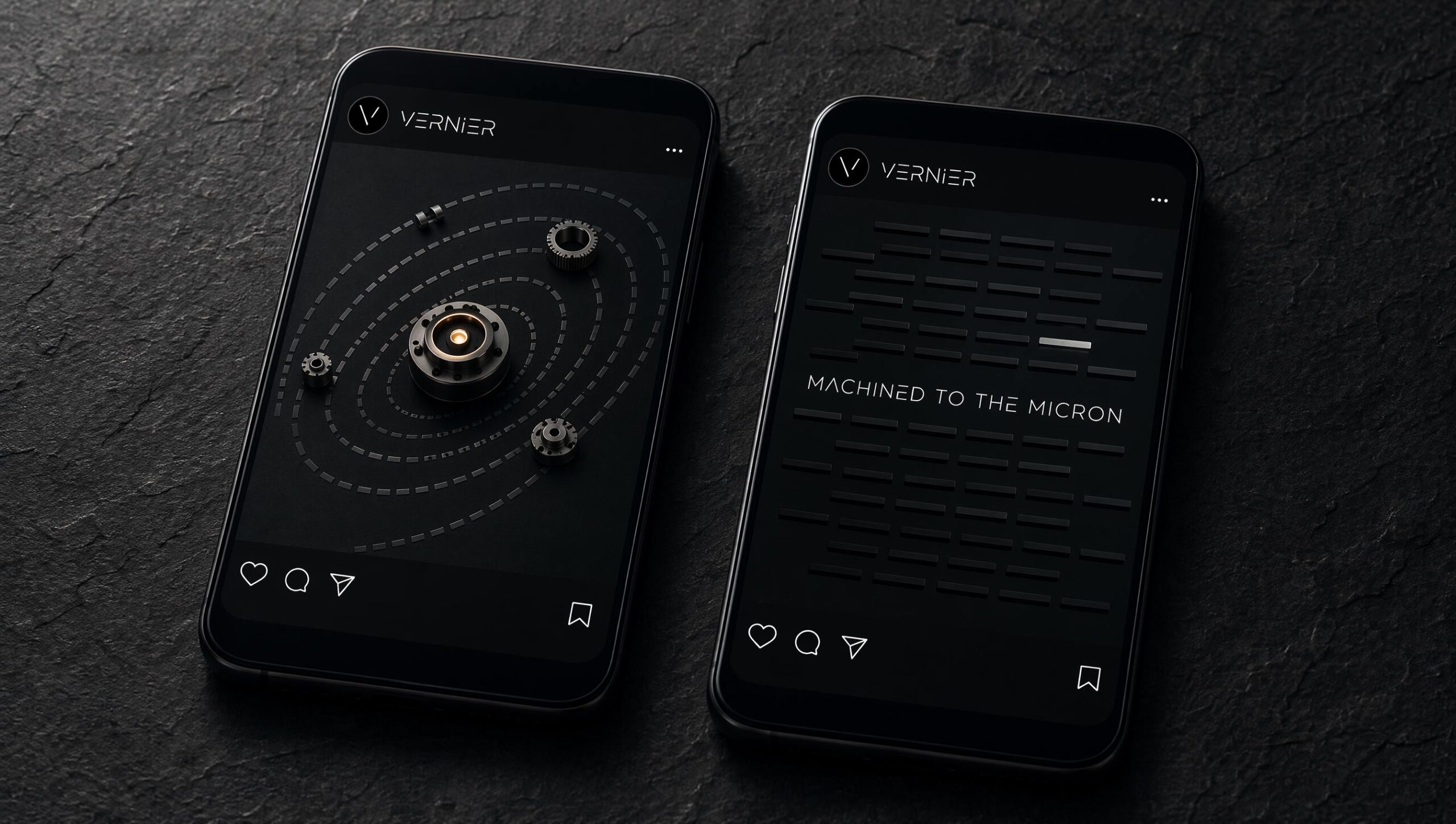
The system pattern is made of tone-on-tone tick marks where a few emerge from the row: the moment of alignment. Payoff: matter born from measurement.
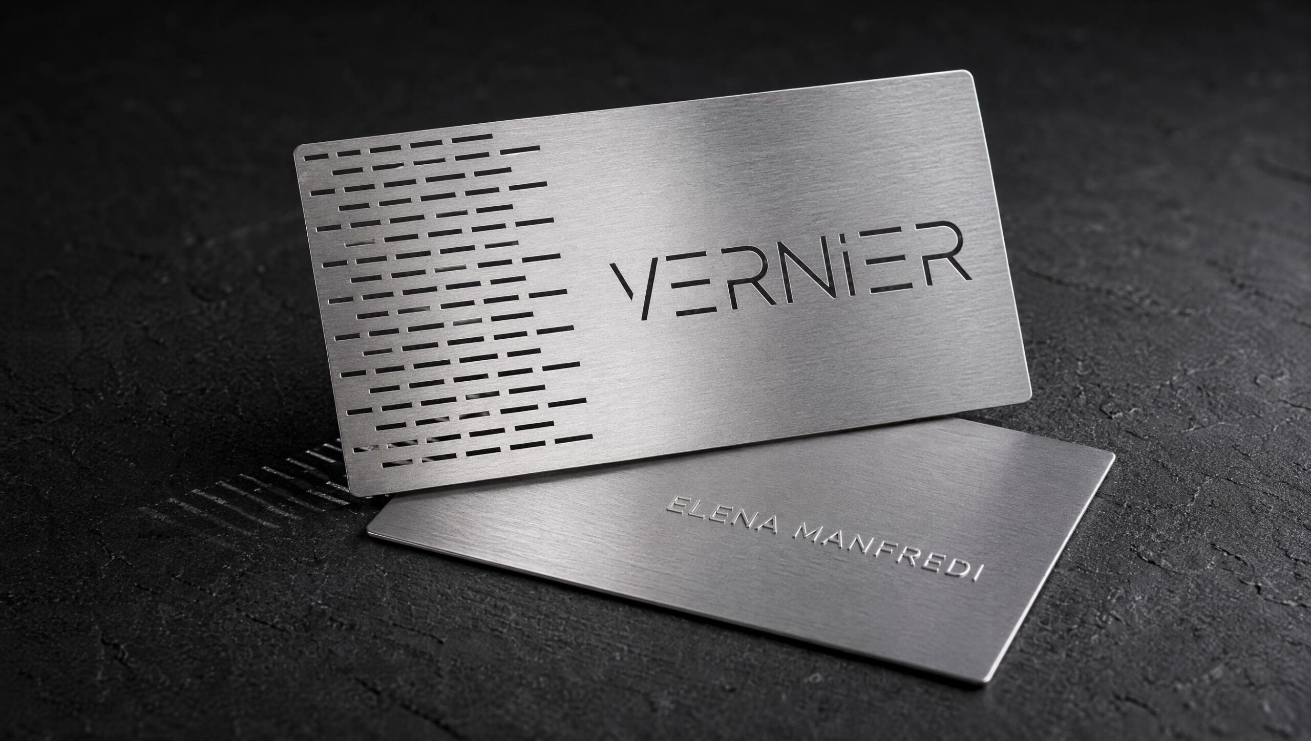
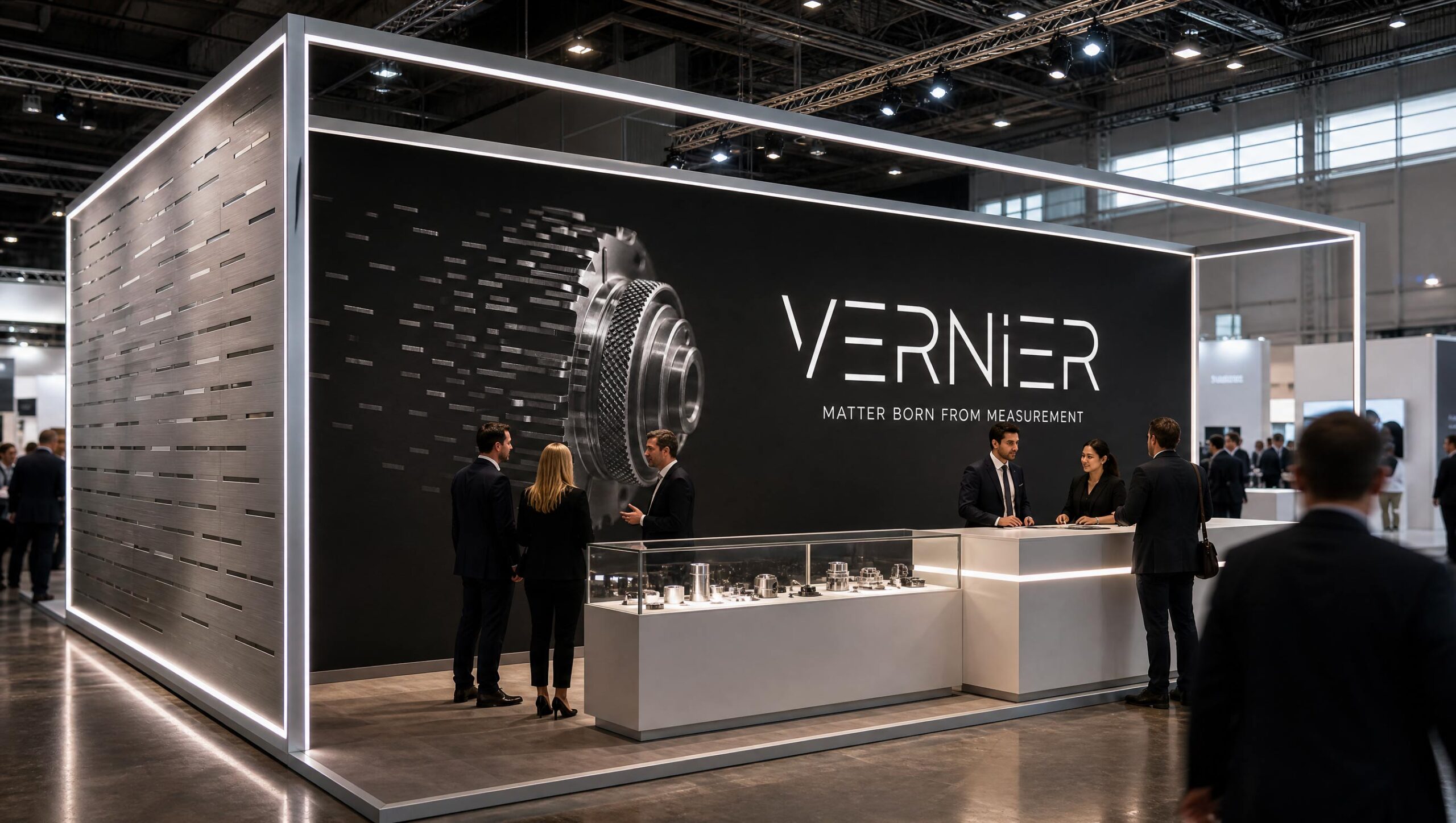
Scope: logo, pattern, business card, exhibition stand, digital presentation, website, brochure, interiors, social content.
Self-initiated concept project.